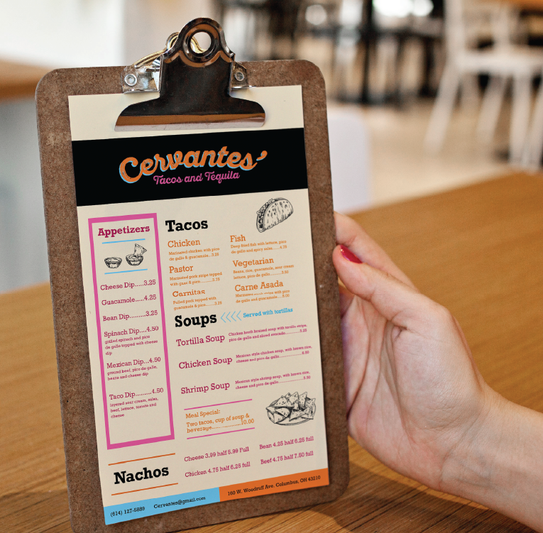
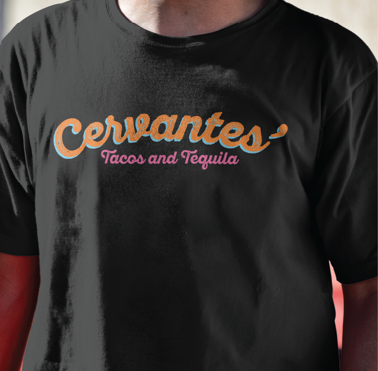
Cervantes Typographic Identity
In this typographic project, I developed four unique brand identities, using the name “Cervantes.” Each logo wordmark was designed to convey the distinct values of each organization using solely typographic qualities.
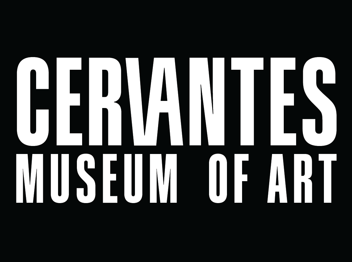
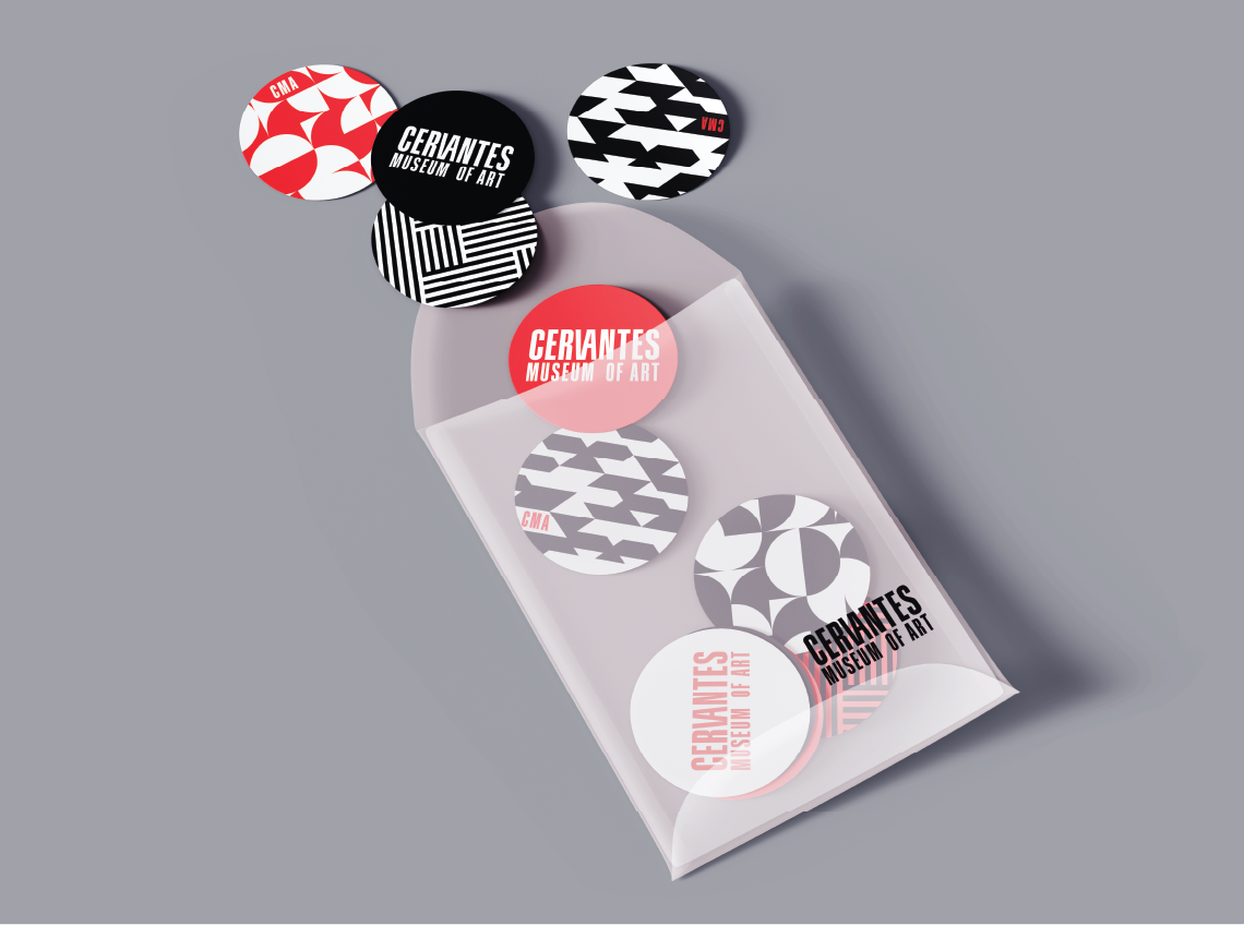
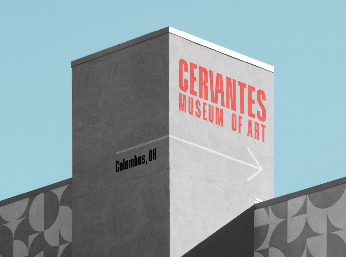
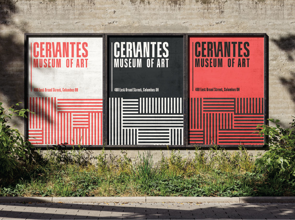
“Cervantes Museum of Art” utilizes qualities inspired by modern art museums. Features such as bold, clean typography enhance the clarity and identity of the organization.
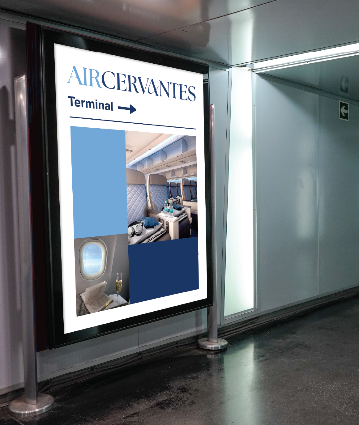


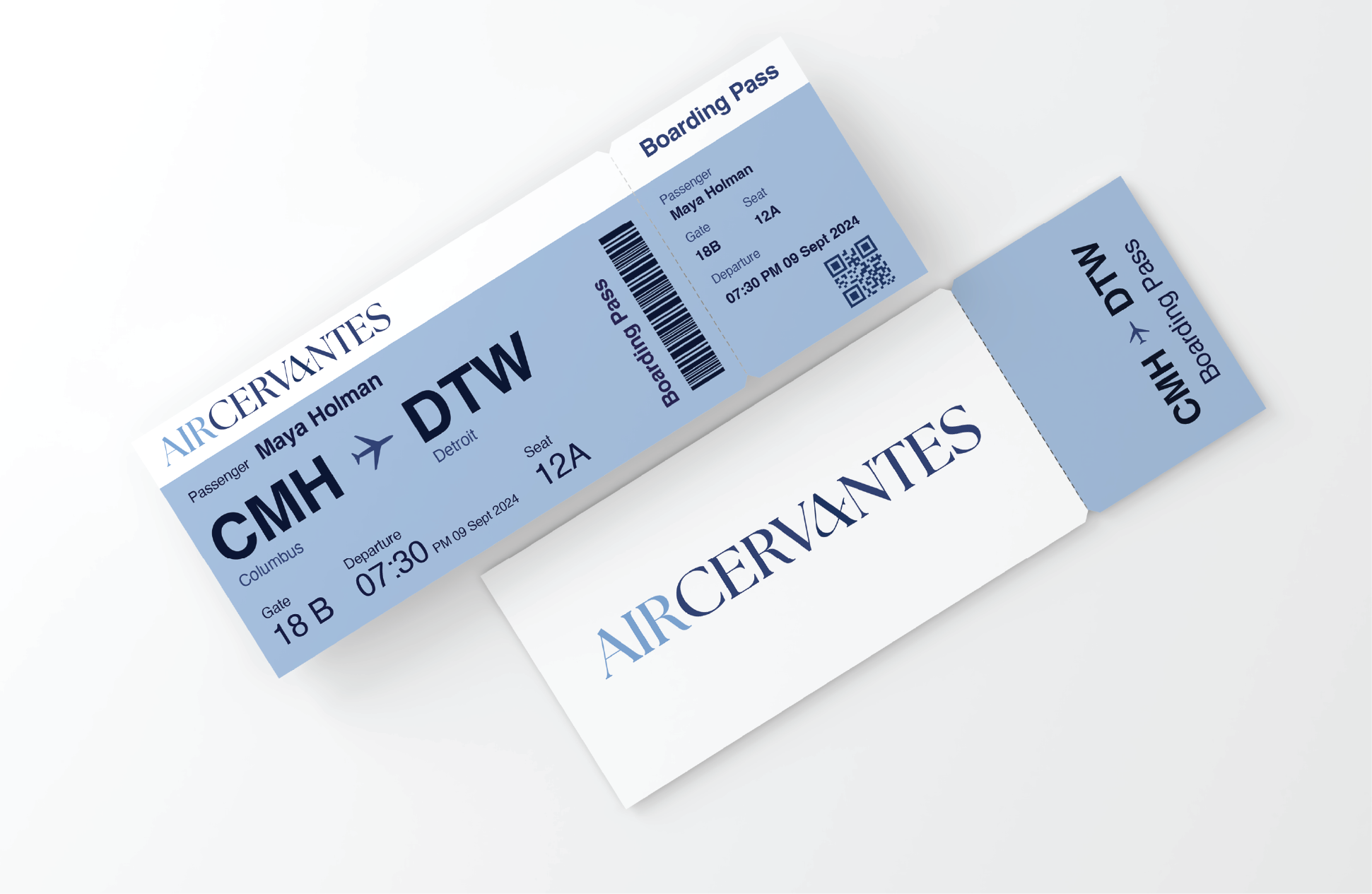

“Air Cervantes” is bases off of a luxury airline. The elegant serif font and calm blue color palette harmonize with the luxurious experience customers receive when flying “Air Cervantes.”

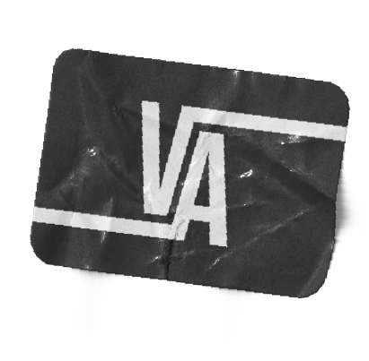
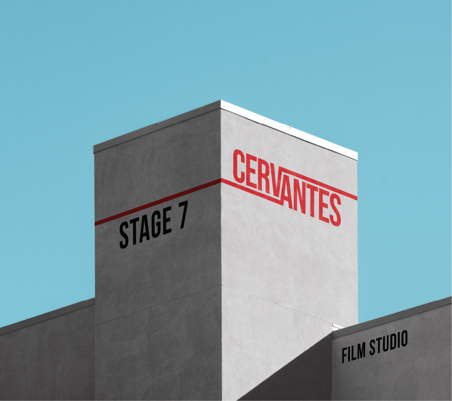

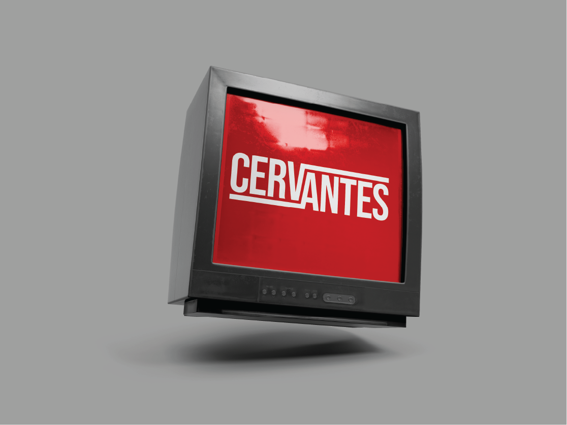

“Cervantes Film Studio” embodies the qualities of Hollywood film studios. The unique “V” and “A” elements reflect the concept of classic film reel tape.