Fueling Momentum:
UX for Collective Wellness
Momentum is a high-energy wellness and goal-sharing app designed for college students. This UX project focused on creating an intuitive, motivating interface that encourages ongoing engagement across diverse wellness goals. Informed by user research, the final design emphasizes personalization, community support, and a seamless user experience.
Why Momentum?
Momentum supports realistic wellness and goal-setting habits, by understanding what motivates students’ and tailoring features to their unique needs related to wellness and community.
College students are seeking balance.

Research
Strava
Pros: Strong collaborative aspects, data integration, customizable goals, frequent challenges and achievements
Cons: Key features paywalled, not beginner friendly
Apple Health
Pros: Seamless integration, intuitive navigation features, free for Apple device users
Cons: Lacks social/community support aspect, minimal customization features
Competitor Analysis
Stridekick
Pros: Built for group challenges, seamless integration, inclusive goal tracking
Cons: Minimal long-term progress tracking, limited wellness tracking, basic social features
Survey and Interview
5 interviews with wellness centered Ohio State students
104 survey responses from Ohio State students
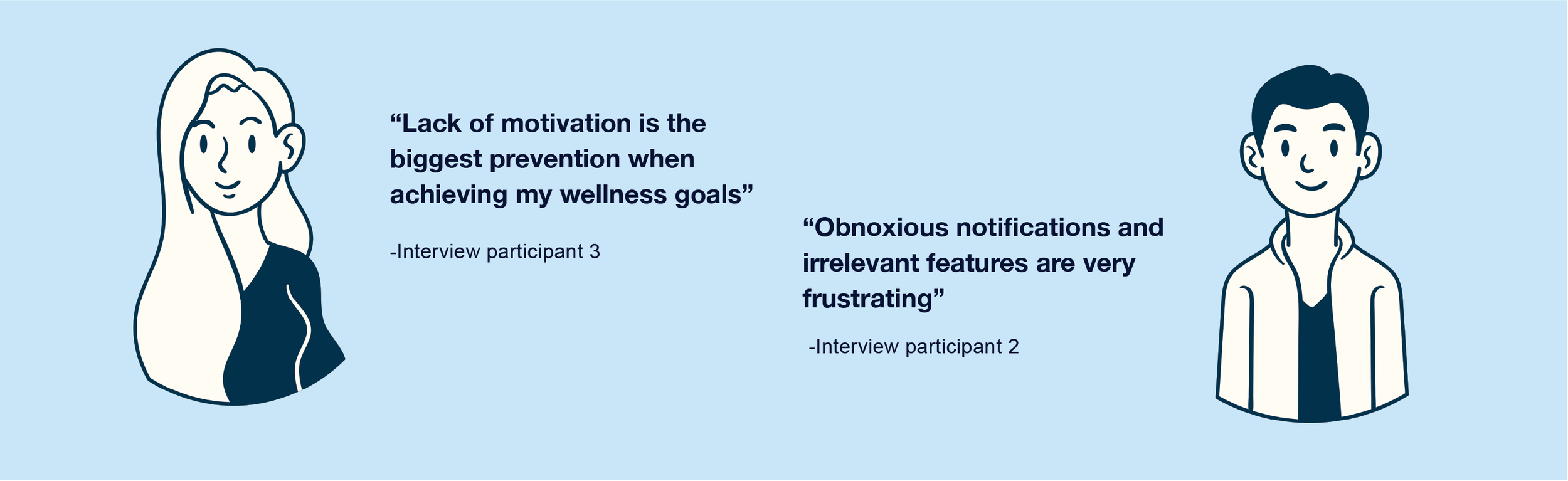
Top frustrations and weaknesses
Current apps are not motivating
Cost barriers
Intrusive/unorganized interfaces
Inaccurate data results
Lack of flexibility and customization features
Most desired features
Wellness features
Step count, sleep tracker, motivational reminders
User specific customization
Device integration
Goal-setting features
Streaks and achievements
Organization and flexibility
Device compatibility
Persona
Sam Brooks
Age: 19
Major: Psychology
Year: Sophomore at Ohio State
Current tech usage: Apple health, FitBit
“I’m excited to grow through fitness and mindfulness, but I need tools that don’t overwhelm me along the way.”
Goals
Improve mental wellbeing
Build physical strength
Maintain consistent routines
Painpoints
Struggles to maintain long-term motivation
Often overwhelmed by cluttered interfaces
Trouble balancing mental health with personal life
Journey Map
Sam is excited to continue her fitness journey and use her new wearable fitness tracker
She is quickly overwhelmed by the app setup and onboarding process, but hopes to learn more about app navigation
Sam continued to use the app and connected with her friends, she is now highly motivated to reach her wellness goals
She is now proficient at using the app and happy with its performance, but feels it lacks mental wellness features which she was looking for to create overall wellness balance
Key Findings
Accessibility
Data synchronization to other devices or platforms is crucial
Free, no hidden paywalls
Simple and effective UI design
Wellness Balance
Apps often are dedicated to either wellness or goal-sharing, few have the capabilities of both
Allowing students to customize their experience
Gamification and Social Features
Increase engagement and motivation
50% of users find motivation when competing against family and friends
User Experience


Wireframes
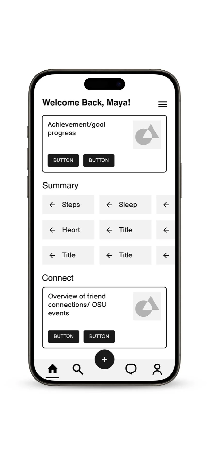
Usability Testing
Goal
This early-stage usability testing focused on understanding the app’s core functionality, navigation and design consistency before visual elements were introduced. I created tasks to evaluate users' ability to complete basic actions, recognize icons and offer feedback. The insights gathered helped identify usability challenges and informed improvements for a smoother user experience moving forward.
Task 1:
Sign up/in using BuckID
Navigate to the goal creation page
Start a new goal
Choose an icon you feel fit for that goal
Task 2:
Sign in using BuckID
Skip all of the onboarding tasks
Check your calendar
Find what is on your calendar on March 1st
Task 3:
Locate the pilates group
Identify the group progress leaderboard
Usability Findings
Pros: Signing up was smooth and felt secure, goal creation was intuitive and exciting, initial exploration was enough to understand the basis of the app.
Cons: No clear distinction between signing up and signing in, UI elements lack consistent style, icon confusion made initial navigation slightly confusing.
Refinements
I enhanced the onboarding experience by adding a guided tutorial and help features to support user navigation. I also refined key icons to improve clarity, ensured greater stylistic consistency across the interface, and added functionality to the areas users naturally gravitated toward.
Design
Bold and energizing
High-impact typography
Dynamic, motivational elements
Flexibility in customizable features
Moodboard


Styleguide
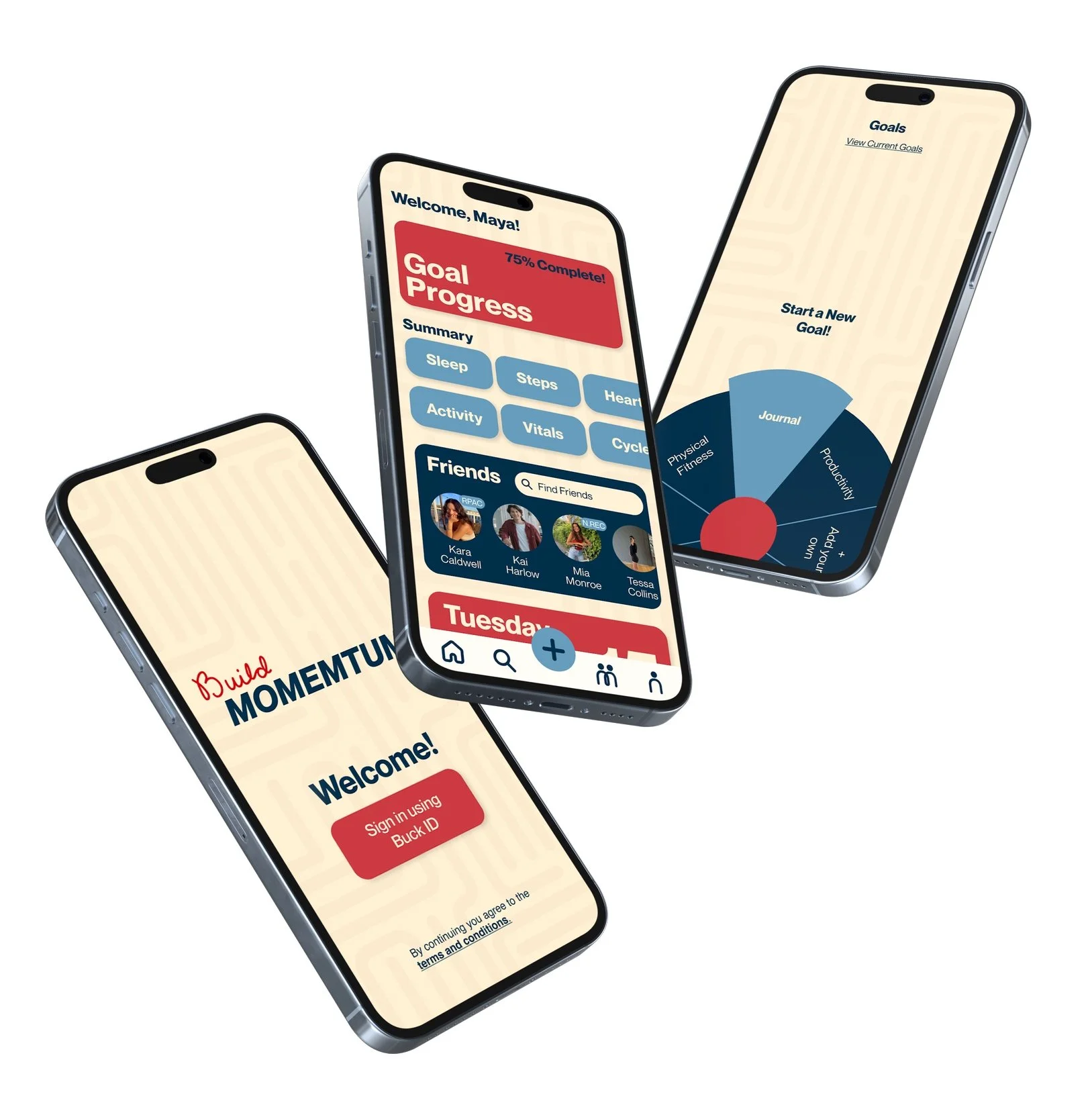
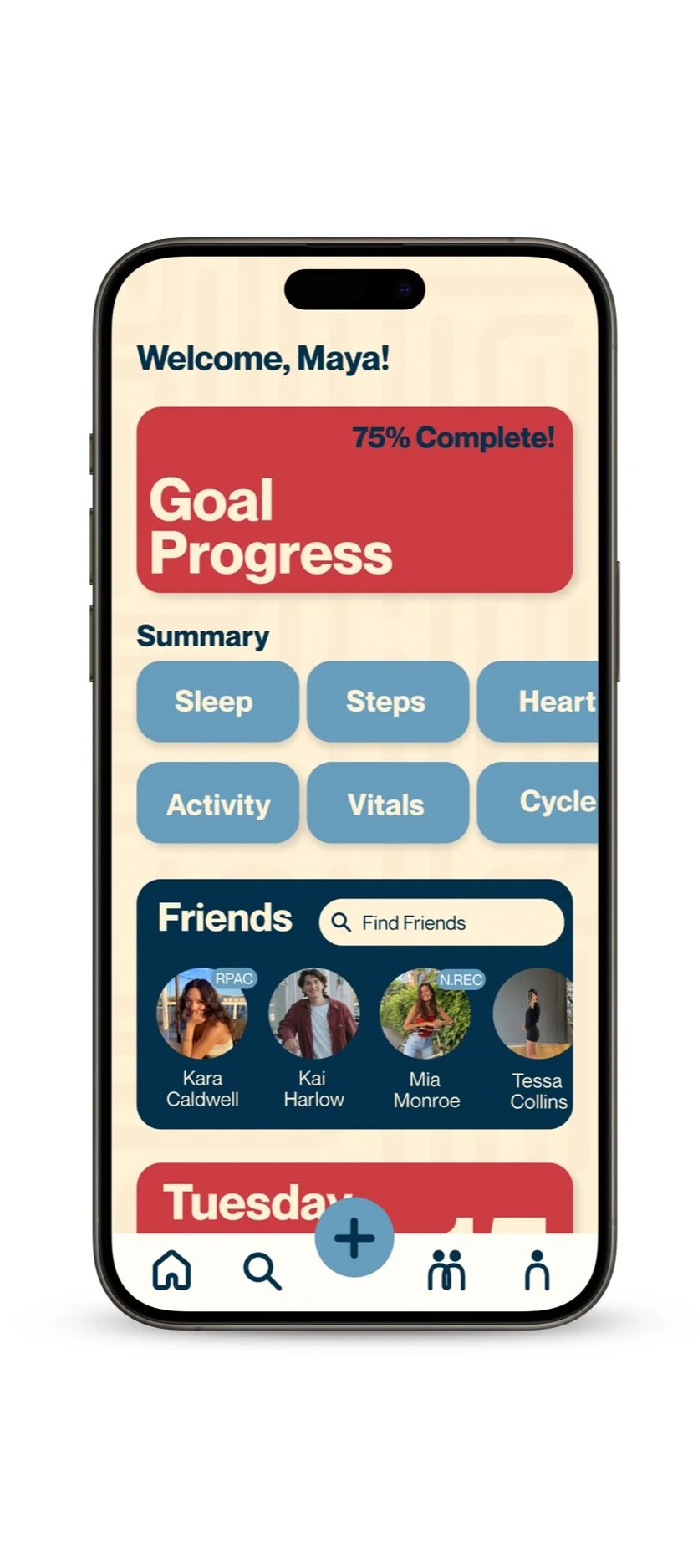
Momentum App
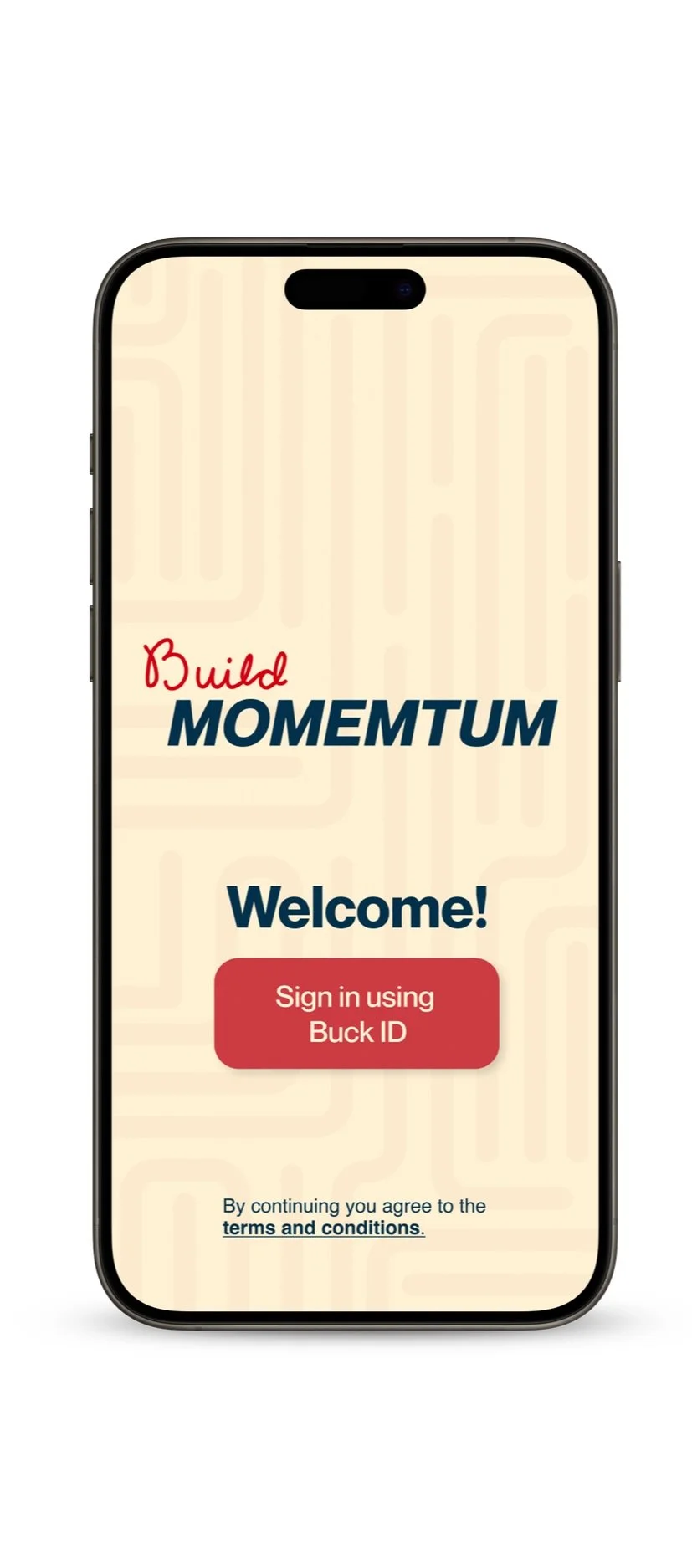
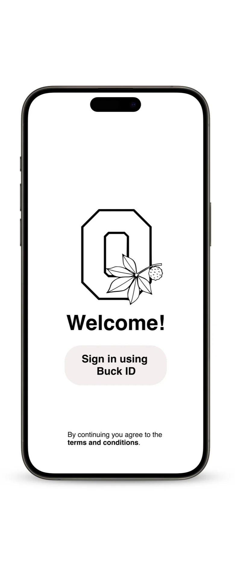
Welcome page where users sign up using their designated student ID, promoting safety and connection within university communities.
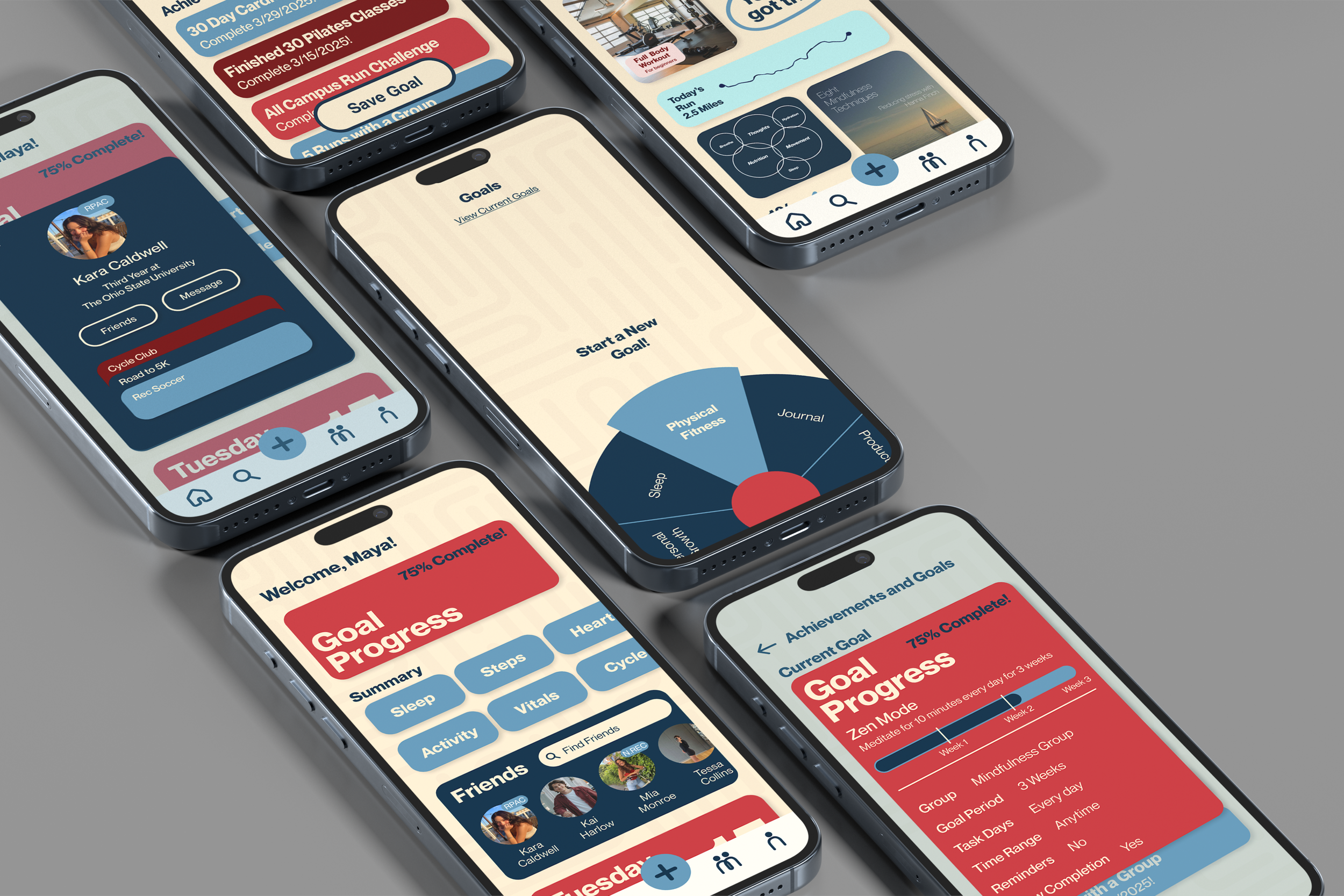
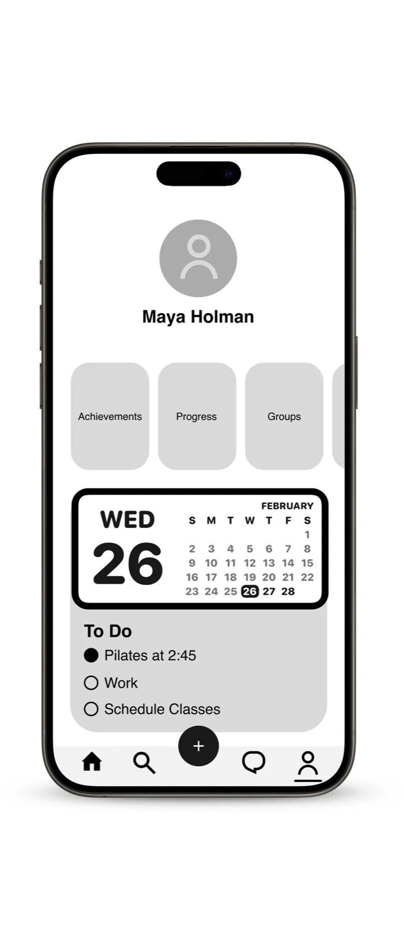
The home page provides a quick overview of key wellness metrics and goal progress, while encouraging social connection and community support.

The spinner wheel adds an exciting and playful twist to the goal creation process. Users spin to randomly select or intentionally choose a wellness category to pursue.
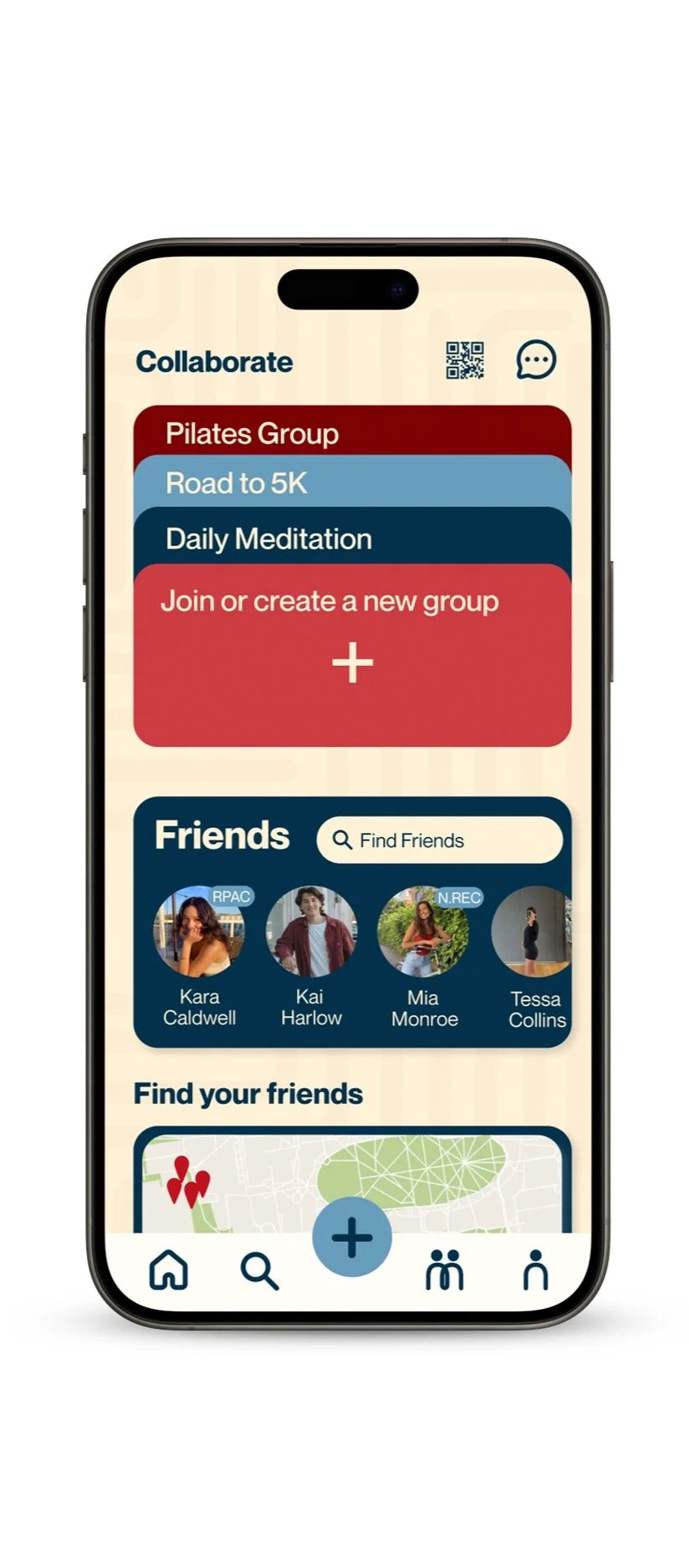
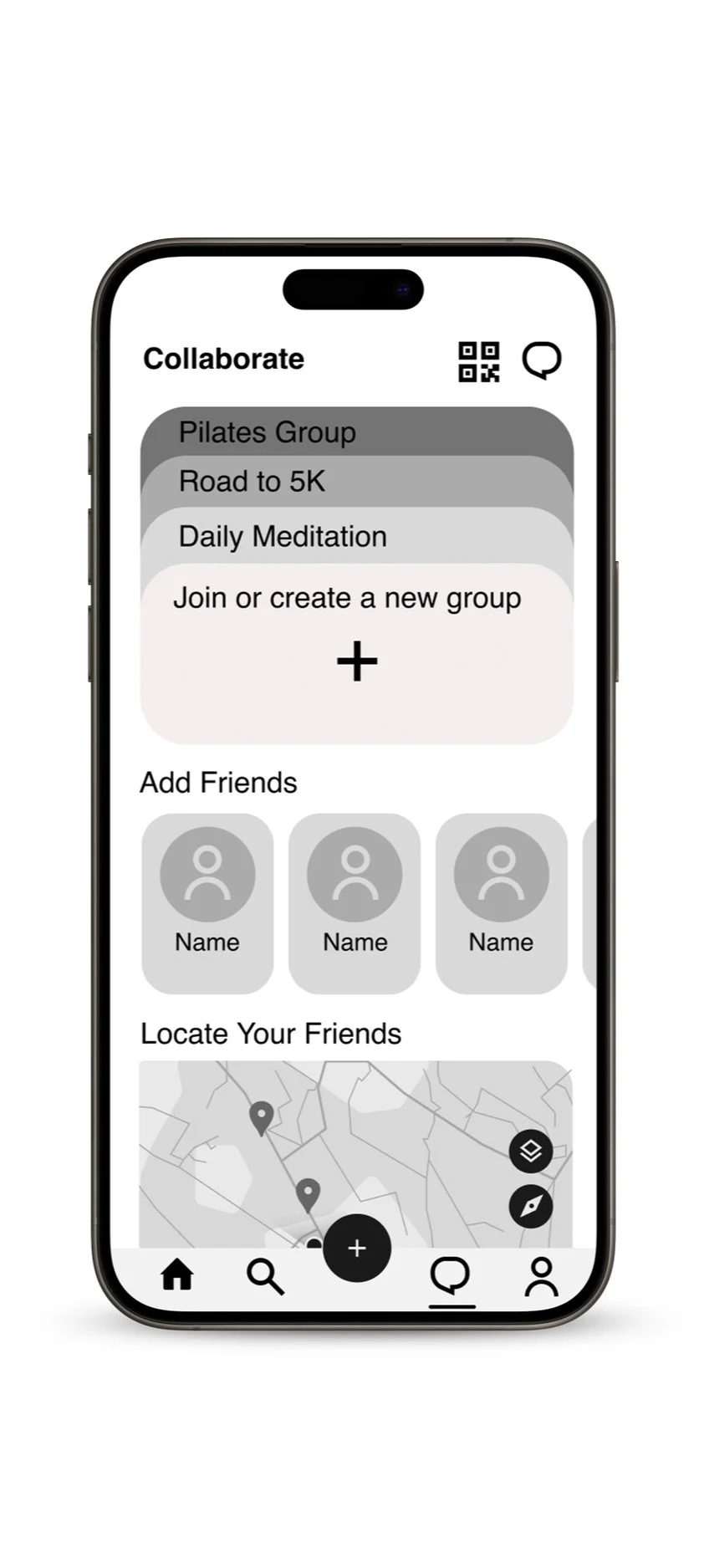
The Collaboration page allows users to connect with friends and join wellness groups. Features like a QR code for quick connections, a dynamic group card display, and a location-based friend finder make it easy to build community and stay motivated together.
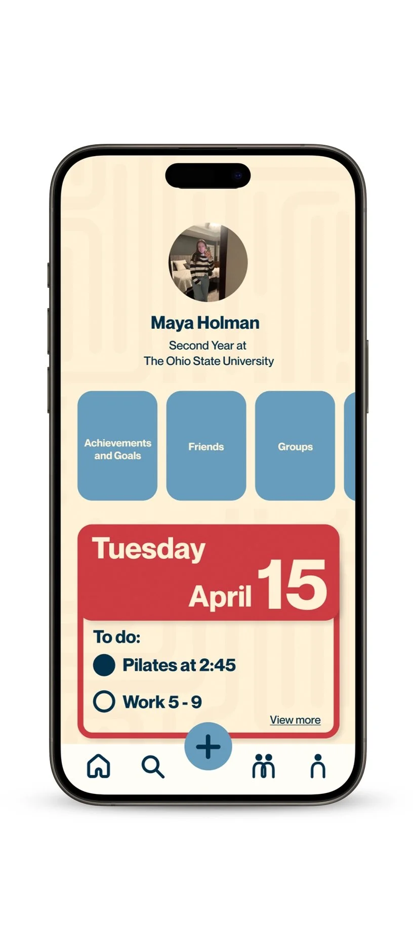
The profile page offers users a more personalized hub to view their goals, achievements, social connections and upcoming schedule.